Why do we design logos? Do they really mean anything?
Yes! A logo acts as visual shorthand to associate an organization with its core values and mission. It’s a graphic mark that becomes synonymous with an organization, making it easily identifiable. As a unique and intentionally designed symbol, a logo becomes a consistent and recurring message to the public on brand identity. Deciding what is represented in a logo — the design elements, the colors, the text — is an important step for an organization.
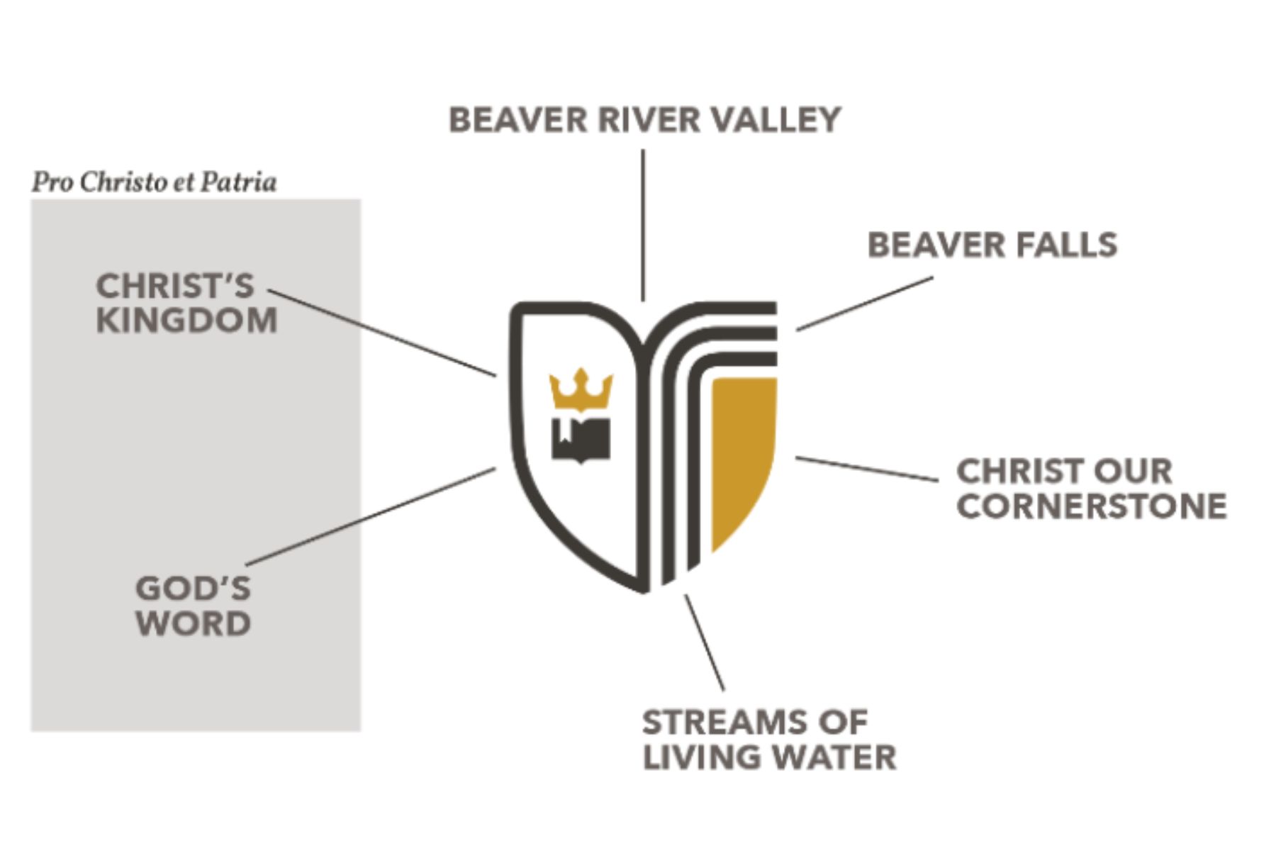
At Geneva College, our logo challenges us to build our lives on the cornerstone of Jesus Christ wherever we may be called to serve. Our logo is simple and distinctive of our core values and mission pro Christo et patria — for Christ and country.
In December 2021, Geneva partnered with 5 Degrees Branding for help in creating a fresh brand that builds on our 175-year legacy in the ministry of education. The goals for the new brand were to:
Represent the unique mission of Geneva College,
Introduce a new logo and brand architecture for everyday use,
Provide a clear Brand Promise that drives our messaging, and
Preserve the institutional seal to be used for official functions of the College.
This rebranding initiative established what we now call the Brand Promise at Geneva:
“Through purposeful learning in a community reflecting the full spectrum of God’s kingdom, a Geneva College experience inspires students to discover a faith-life calling in service to God and neighbor.”
The Brand Promise guides all the work done at the College, both internally and externally, and determined the essentials for our logo. Our logo is defined as a combination mark because it has a pictorial mark that almost always sits next to the words “Geneva College.” Each design element within the logo is a visual representation of our motto pro Christo et patria and our location in Beaver Falls, PA.
Geneva’s distinct mission to equip students for faithful and fruitful service to God and neighbor is signified by the crown over the open Bible on the left side of the shield. With Christ as King and under Scripture, the mission of the College is pursued fervently.
Since 1880, Geneva’s neighbors are right here in Beaver Falls. The top of the spade dips in the middle to remind us of the Beaver River Valley in which Geneva College is located.
The three lines curving down from the top dually represent the original upper, middle, and lower falls in Beaver Falls, as well as living water, a metaphor for the nourishment we receive from God and a reminder of the life we have in Christ. It recalls the words from Jeremiah 29 in which we’re reminded that the Israelites were called to build houses, plant gardens, and seek the prosperity of the city in which they were living.
Last but certainly not least is the gold cornerstone within the spade, representative of Christ as our cornerstone. A cornerstone is the solidifying stone of a structure, often one that joins two walls, and creates a steady and secure structure. In Christ, all things hold together; He is our cornerstone.
Geneva’s logo stands apart from our College seal, which is used primarily in the Office of the President. The seal is elevated for use in spaces that call for institutional and academic significance. In contrast, you’ll find our logo everywhere on campus and in our marketing materials — again and again, we share our Brand Promise and mission through the visual elements in our shield. Pro Christo et patria in the Beaver River Valley, with Christ as our cornerstone.
By Hannah Schultz
Opinions expressed in the Geneva Blog are those of its contributors and do not necessarily represent the opinions or official position of the College. The Geneva Blog is a place for faculty and contributing writers to express points of view, academic insights, and contribute to national conversations to spark thought, conversation, and the pursuit of truth, in line with our philosophy as a Christian, liberal arts institution.